Orem City Arboretum Site
What I learned:
- Accessibility and high quality website design
- Accepting user feedback and prioritizing the user’s experience
- Attention to detail and organizing large amount of content on a site.
Research
We talked with our client a lot to understand the project as best as we can, starting with understanding who would be the main users of this site.
Once we understand, we create a proto persona to help us empathize with the users throughout the design process.

Moodboard
As part of our research, we also looked at similar websites that represent an arboretum, have a nature aspect, or are able to display a large amount of information and text in an organized, and digestible way for the users. This helped us brainstorm and get ideas for how to continue forward!

Sketches
Drawing out the design ideas helps to see the overall harmony of the site quickly and to be able to erase and try new combinations of designs together.
Once our team felt good about the designs, we solidify it and build off of the sketches for the first digital design.

Style Guide

We created a style guide of what we followed while creating the website. This allowed us to make sure everyone was on the same page of what fonts, type sizes, size weight, and the different colors that we will stick with throughout the entire design. The main priority with the style guide is to allow the site to look cohesive.

First Digital Designs
We then started building basic layout in Figma to start making something we could test on our target audience.
We built our first revision by following the sketches’ layout, style guide, and filling in photos and text that our client gave us to incorporate.
User Testing
Once we got a first design revision finished, we made a prototype of it and took it to the park to test it and get feedback from people that would be the ones using the site.

User Feedback
User testing our design and getting real feedback from new perspectives was eye opening and helped us revise our design and make some changes. Prioritizing the User’s experience with our site was the number one prioritiy so we took their feedback very seriously.
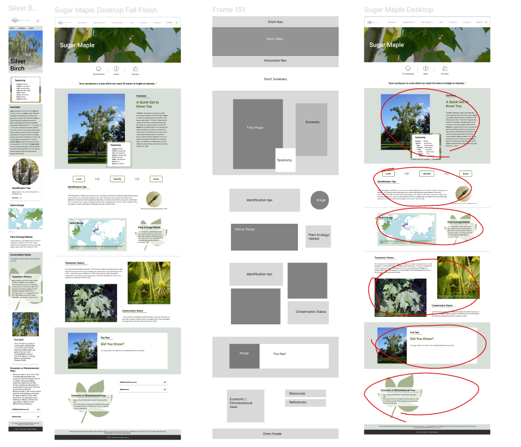
The first revision is on the left and the final revision is on the right.

Attention to Detail
Designing the details is crucial to me. We made sure that each image had a description under it for accessibility purposes. We wanted to make sure that those that are using screen readers are able to enjoy the entirety of the site.

Screen Reader
We really prioritized accessibility. We ran numerous tests on the site throughout the design process to make sure that everything was accessible enough. We checked things like color contrast, or features that the accessibility tools can’t read very well.

Communicating with Team
We worked very closely with the developers, client, and other team members on this project. We prioritized meetings, and messaging the team with updates daily, and continuing to move forward with everyone being informed and on board with decisions.
As designers, it was crucial to make sure that we were designing what our client wanted, and what our developers could create.

Components
We made Figma components to reuse the same designs throughout our site to save time, make it easier for our developers, and to create harmony over the entire site and make it look cohesive.

Final Product
What I learned:
- Accessibility and high quality website design
- Accepting user feedback and prioritizing the user’s experience
- Attention to detail and organizing large amount of content on a site.